*I messed up my last blog, so im reverting back to my blogspot and reposting everything*
For this project we have been asked to create a Visual system that shows relationships between information, based on any topics of our choice.
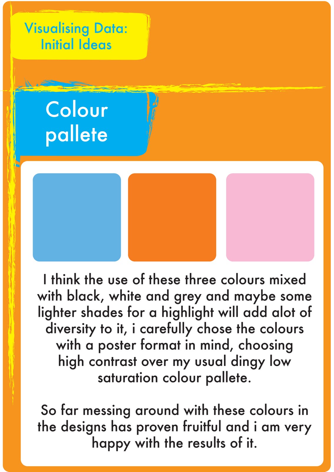
We were asked to produce a design that visualizes a group of different data into a structured diagram, the data had to correspond with each other and be represented in a way it could be understood.
In order to begin this project we will be looking at structuring and categorising information and recognising the relationships between different types/fragments of information.
Some could be linked, ie, time and date but some might be thrown together only by concept. For example, My final choice was on home office crime statistics, They may be about people, or things (objects/Variables) or events. The systems that are present in the data and its corresponding anti data would be based around 'Area' And rates or comparisons on different crimes, I explore this further later on.
What sub-systems are involved, this is something I looked into: (the rates or occurrence of crimes or victims and their representation?) We have been generating ideas as a group so that we can get started quickly. The main objective of this project was to visualize data or statistics and map the relevant relationships between the information. The data can be comparative, balanced or imbalanced or simple statistics, this leads us too design something which isn't just attractive to the eye, but attractive to the mind in a way that it can understand the data represented easily.