Overall i think my final piece ended up exactly how i imagined it, it took a lot of rummaging around the internet to find the plug-ins and techniques i needed to pull what i had imagined off, but i think it worked well in the end.
If i could do it again i would choose to finish the song, but due to the timescale we were given i chose to do only the first verse and chorus as to not make the video too long, and to give myself sufficient room to breathe when producing it.
What i feel didn't work too well is the first stage is a bit dim due to the effects applied to it, but looks too bare without them there, as i could not justify having mismatching effects and for the sake of keeping it together i kept the effects and will have to hope the dimness doesn't ruin the final feel of the video.
i feel the timescale wasn't too restrictive, but it was challenging due to having to learn the program as i went along.
""My final piece is too big to upload at the moment, but will be in this space when i can render it for 6 or so hours again""
Thursday, February 24, 2011
Narrative Project: Lyrics

These are the lyrics i have used in my composition, it tells the story of the journey of an immortal being going mad after outliving everything that exists.
Narrative Project: Inspiration 2
I am using a similar effect to the one shown in this video, and was looking for ways to improve it, i thought this was a particularly good example, i do not have the time span to create effects as realistic as this one though.
Narrative Project: Inspiration
This video gave me an idea of the sort of lightning effect i wanted running behind the text on stage two, i am trying to make my lightning as realistic and effective as this ones is.
Narrative Project: Design Progress 3

This is a fully rendered version of my second stage visuals, the lightning and rain effects are now complete, and the glitchy typography and distortion mix well with it, i have separated the two stages by making this one a motion background with the foreground being the text and lightning, the sky will move between lyrics. I am happy with this stage now.
Narrative Project: Design Progress 2
Here is a screen of the second stage of my render, currently without the lightning and cloud effects as i implement the lyrics and type better. I would post video clips if it didn't take 5 hours to render them.

Here is the unrendered version of my current type and background of the initial stage, and following it is the distorted and effect rendered version of it.


Here is the unrendered version of my current type and background of the initial stage, and following it is the distorted and effect rendered version of it.


Narrative Project: Effect Screens
These are screen-captures from my current render, the effects used in this were extensive and took a long to too apply correctly, The RGB split on the text, the lightning and the light burst style objects were among some of the more complicated effects used in this composition to provide the dream-like visuals i was intending for my final piece. In motion these effects are really striking and improved the originally bland looking composition which i will include in a picture in my next post.


Narrative Project: Storyboard

This is my basic idea for the progression of my video, i will be doing it in two stages (Verse/Chorus) I have progressed with basic visuals and decided to go for a mix of space and water creating a dreamlike stage moving into a sky based stage with more focused type to get the more prominent words of the chorus across. I will be doing this all with motion and using strong aspects that compliment music such as stuttering typography, distorted visuals and music spectrum (a moving representation of volume) to combine with the predominately type based project.
Narrative: Song choice
This is the song i have chosen to use in my composition, i will only be using the first verse and the chorus to cover the storyline of the song, and to keep my composition to a more desirable length of around two minutes.
Narrative: Basic Visuals
As an idea of what i will be producing, i found these images which when combined with the song i have chosen i think will provide an insight into the sort of visuals i am looking into producing, obviously reproducing this sort of visual with motion graphics: Especially with a program i am extremely inexperienced with using will be difficult, but i am looking into plug-ins and methods to help produce my desired final product.


Narrative Project And initial ideas
I am now producing my narrative project for my new brief, instead of choosing an existing story or fable, i have gone with the option to gear my production to a piece of video, i will be producing this video on mainly After effects, using lot's of kinetic type and strong mysterious visuals, the song i have chosen to use is Jetpacks was Yes! by Periphery, i feel the strong storyline elements of the song combined with the crazy breakbeat and electronic start will make for interesting compositions and would work well with the style of visuals i am aiming to produce.
I decided on this line of design by first choosing a topic from the brief out of two i had in mind, and then picking this song out of several due to implications of using them.
Initially i was choosing between: Good and Evil / Journey based narrative
My initial ideas for good and evil were as follows:
- Stopmotion incorporating yin and yang and the japanese Legend of it:
- Dr Jekyll and Mr Hyde story done in two minutes using After effects
Both of these ideas proved laborious and were not worth spending time on, when a much simpler idea could achieve a much better outcome, so i chose to do a journey, using after effects over stopmotion to make it more interesting.
i then decided to do it to music, using a song based on a narrative, so i had to chose between a number of songs I had in mind, which took a very long time.
Friday, January 14, 2011
String is my thing

So for my new project i have too work with a 2 meter length of string, and with it tell a story. This is a REALLY open brief, with the final piece having to be represented in print, this is my final idea for this, which went along a few paths and led back onto itself, initially moving away from this idea i decided it was better than the alternative i had been working on, which was quite a setback.
this image is a representation of my morning routine, anchored from the centre of my room in bournemouth to all the stuff i usually do throughout the course of a day.
Wednesday, January 12, 2011

Monday, January 10, 2011
Postcard: The new design

Ive been working on this for a few hours now, and i really think this typographic design has come along wildly, i made the headline into some 3d text and as im only meant to be using text, replaced the body elements like the perspective grid with words instead of solid colours, the effect is quite modern looking, i used a crazy font for the 3d.
Postcard Progression 2
Now I have produced a postcard in my usual photoshop style relying on images and textures, I am going to make a illustrative one using only typography which will fulfill my university brief. I will be again reverting to a CMYK Colour pallet, using illustrator to produce my final piece and colours.
My colours will probably be cold colours to go with the theme, with a burgundy or dark red fitted in to show the violence of the story.
My colours will probably be cold colours to go with the theme, with a burgundy or dark red fitted in to show the violence of the story.
Sunday, January 9, 2011
Postcard Progression


This is the bit where i show you the development of my most recent project: The headline incorporated postcard. I ended up going for "Icy conditions bring chaos to the roads" What with it being quite suited with my recent car crash and injuries. I am sticking to the violent-esque theme, instead of a slash or a cut, i decided to go with a smash! instead.
Wednesday, January 5, 2011
Visual project: Postcard reference

I have been trying to find some reference on similiar postcards to my idea, and cannot find any, I did however find some horror / Movie themed postcards which run off a darker vibe than usual postcards, and i must say i really like the bottom left postcard for a french freakshow by the look of it, it's awesome.
Tuesday, January 4, 2011
Visual project: Postcard
So for my new project i am aiming to create a postcard displaying a headline from a local or national newspaper incorporating the text from the news to portray the story, i have a few interesting ideas on this already, using the normal postcard format and possibly a cut out in the center.
I aim to be using a violent headline, with possibly a slash or cut through the middle of the postcard to emphasize the violence the story contains, i will post some rough designs up as soon as i find a suitable story.
I aim to be using a violent headline, with possibly a slash or cut through the middle of the postcard to emphasize the violence the story contains, i will post some rough designs up as soon as i find a suitable story.
Monday, January 3, 2011
Visualising Data: Conclusion
Throughout the project i have learned a few things about handling data, and found a spreadsheet to be my new best friend when doing things like this, I also found using a colour palette and sticking too it can enhance your final imagery and challenge you into finding different ways of doing things.
The drumming rudiments idea would have been fun to do, but it really proved unlikely to find a type of data available to me that compare to the patterns, therefore i am very happy with my final idea choice, the crime VS how scared statistics proved to be interesting to compare and shows that people from the north west are made of harder stuff than the rest of england.
If i was asked to do this project, i would still choose the same sets of data, and using the home office website to proved to be really helpful in finding governmental data.
I found the project quite challenging at first, and i had to look really in depth to find the solutions and data i needed, finding it hard to arrange the data at first i soon learned a routine for organising it that worked for me,i was struggling alot at first to find something to base my final idea on, i changed my three initial ideas several times.
Overall i am very happy with the final piece i have produced for this project, i found the whole experience to be a learning one.

Visualising Data: Final piece completion

After trying several methods of implementing the second key, i went for a traffic light coded slash underneath the name of the region titles, i feel this is a clear representation, and goes with the Web 2.0 / Street art theme of the rest of the piece.
The final piece is showing some definite relationships between the two batches of information, the one abnormality is that the Northern eastern region is full of crime
but the residents aren't scared to be alone walking, showing that they are made of harder material than the rest of us.
Visualising Data: Final piece progress 3

I have now changed the yellow back to a pink to match more with the colour scheme, and made the overall colour scheme a bit brighter, I have started adding background and small informative details like the speech bubbles from the drumming rudiments piece.

I am now working on a code for how scared each region is, I am thinking carefully about how to implement it.
Visualising Data: Final piece progress 2

I have added the colour code i devised for AVG Crime rates of englands populations, I have divided both sets of data into three sub class's so they could be put into some sort of code, i will then lay the two coded maps over eachother so you can compare which places are scared because they have lots of crime, and which places are scared for no reason and vice versa.
My final piece is coming along nicely now, and the colour palette compliments it really well, i Added a yellow to the palette to give me enough colours to add to the key.
Visualising Data: Final piece progress

I have just finished the vector of the regions i will be using, soon i will be colouring and stylizing the map and forming the graphical key i will be using to differentiate between both types of information i will be involving in the project.
Visualising Data: Compiling data completion

I have now compiled both sets of data into the spreadsheet, and arranged them so both sets correspond into something i can arrange graphically.
I have started looking for a decent quality vector image of the UK to divide into sectors and use for my final piece.
Visualising Data: Compiling data
I now have my crime data in a spreadsheet waiting to compare it with the crime awareness data, so far so good. Both sets of data is divided into the same regions of england, with percentages and Avg crime rates being the data being compared. I have added formula to the end of the spreadsheet to gather myself a certain and updated comparison between the two sets of data.


Visualising Data: Colour pallete lives on
One thing that came out of my drumming rudiments design that i truly enjoyed, is the colours. You got a bit of a glimpse at my last post on how the design looks but here is a closer view, i have gone for my chosen pallete but a bit lighter, with lots of negative space and very 'Web 2.0' styling on my final piece.
As i develop my crime final piece, you will see it shape up with this theme.

As i develop my crime final piece, you will see it shape up with this theme.

Visualising Data: The death of an idea
After finding the accurate and more interesting information on crime and the public's opinions on it, my drumming rudiments initial idea has now become obsolete, however i am still very happy with the rudiments poster and will probably print it out for myself as reference.

RIP Drumming rudiments initial idea.

RIP Drumming rudiments initial idea.
Visualising Data: Collecting data 2
When going through the home office website for data, i came across the crime statistics section, and was stunned at the amount of cohesive information they had released to the public.

At this point I started to feel that the drum rudiment idea was also obsolete, and that my themed and colored mock up would serve as good practise for my final piece, which would now be about Crime.

At this point I started to feel that the drum rudiment idea was also obsolete, and that my themed and colored mock up would serve as good practise for my final piece, which would now be about Crime.
Visualising Data: Collecting data
When looking into data for my final piece, i found it very hard to find cohesive data, drum rudiments are obvious to me as a drummer, but finding some sort of patterned data to match up to it was extremely hard, however finding data for crime became so much easier when i came across the home office website:


Sunday, January 2, 2011
Visualising Data: Initial Colour pallet and speculation
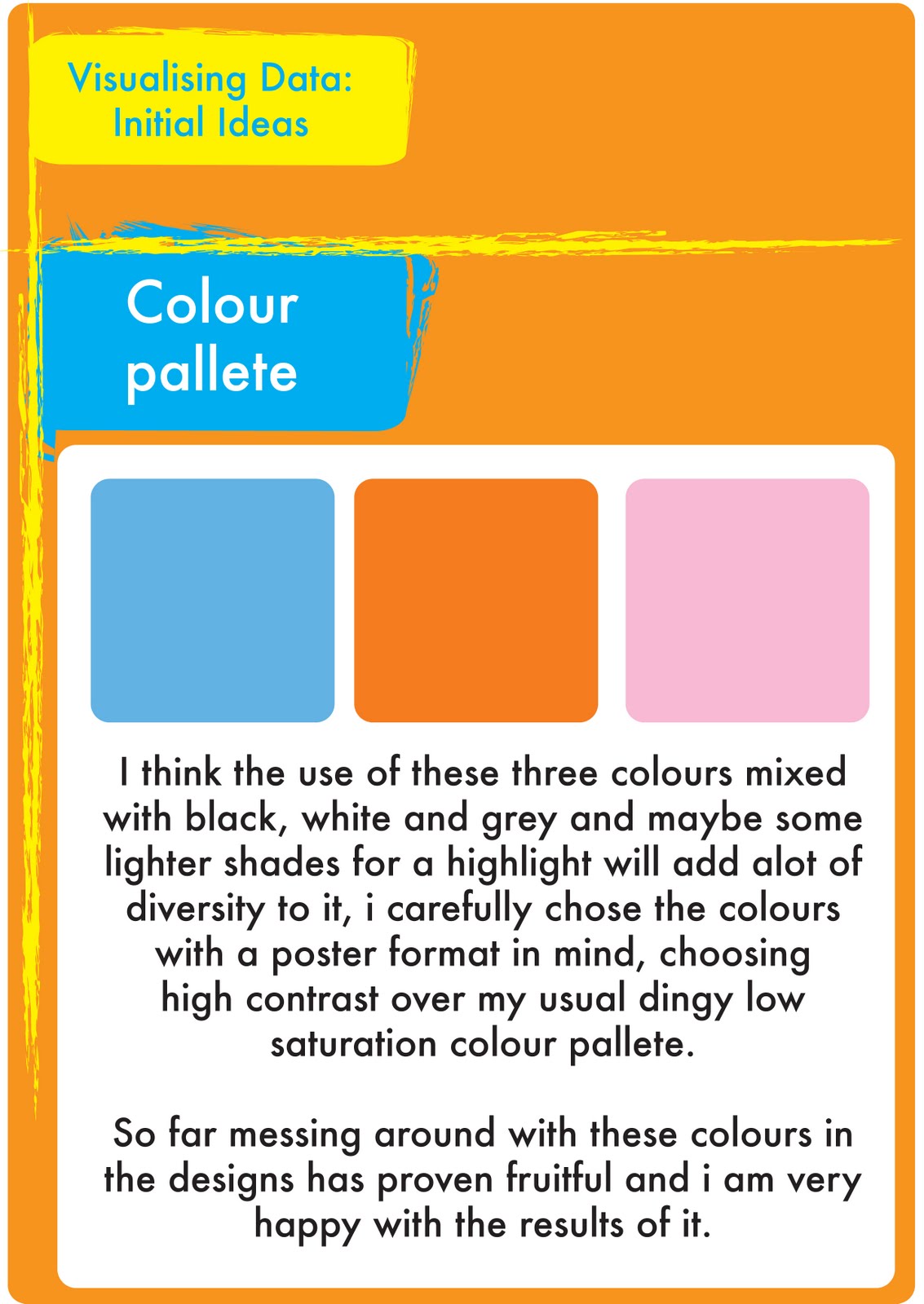
After using these colours in my prototype drumming rudiments design, I am so far very happy with them, i will continue to play with various shades until i get my penultimate colour pallet for my final design.
Visualising Data: Initial design ideas and speculations

My initial ideas are now coming together, I took my notes and summarized them in this image, So far i think the food price and poverty numbers idea is a bit obsolete, i think this is pretty much ruled out as a final design idea, i am trying out the drumming rudiment and crime ideas, finding the data for both and deciding which one is more suitable
A mock up of the drumming rudiments is coming together, and i will post it soon.
I am currently working on my Colour pallet, I have a few ideas for colour use which i think will make my work a bit more exciting to do.
Visualising Data: Initial thoughts and brief ideas
*I messed up my last blog, so im reverting back to my blogspot and reposting everything*
For this project we have been asked to create a Visual system that shows relationships between information, based on any topics of our choice.
We were asked to produce a design that visualizes a group of different data into a structured diagram, the data had to correspond with each other and be represented in a way it could be understood.
In order to begin this project we will be looking at structuring and categorising information and recognising the relationships between different types/fragments of information.
Some could be linked, ie, time and date but some might be thrown together only by concept. For example, My final choice was on home office crime statistics, They may be about people, or things (objects/Variables) or events. The systems that are present in the data and its corresponding anti data would be based around 'Area' And rates or comparisons on different crimes, I explore this further later on.
What sub-systems are involved, this is something I looked into: (the rates or occurrence of crimes or victims and their representation?) We have been generating ideas as a group so that we can get started quickly. The main objective of this project was to visualize data or statistics and map the relevant relationships between the information. The data can be comparative, balanced or imbalanced or simple statistics, this leads us too design something which isn't just attractive to the eye, but attractive to the mind in a way that it can understand the data represented easily.
Subscribe to:
Posts (Atom)